Context: What problem was I trying to solve for Korean dog owners?
In Korea, it's surprisingly hard for dog owners to know which restaurants, cafes, parks, and shops actually accept dogs. Many places use vague 'We are dog-friendly' labels that don't explain whether dogs are allowed indoors, only outdoors, or under certain conditions. Information on Naver blogs, Kakao Map, and Instagram quickly becomes outdated, leaving owners guessing or calling ahead each time they go out.
At the same time, eco-friendly insect-based kibble is becoming more common in Korea, but many owners don't know where to find it or why it matters.
To make everyday outings easier, I developed GOAMOGO, a mobile app that helps Korean dog owners find pet-friendly locations directly on a map while also learning about different sustainable kibble brands in a simple way.
The Challenge: How can we make going out with our pets in Korea feel less stressful
Korean dog owners usually face:
- unclear rules at cafes and restaurants
- pet-friendly information scattered across multiple platforms
- low awareness of sustainable pet food options
My challenge was to bring this information into one place, in a way that feels easy to use.
Solution: A simple map-based app for Korean dog owners
GOAMOGO gives users:
- a map showing dog-friendly spaces with direct access to their contact and location
- contextual explanations about insect-based kibble and treats

Competitor Review: What existing platforms lacked
I looked at:
Naver Maps
Kakao Maps
Instagram review posts
Korean pet community apps
Common gaps included:
inconsistent or outdated pet-friendly details
no simple view that gathers dog-friendly places together
no educational content around sustainable kibble

Ideation: Turning a vague idea into concrete screens
Based on my research, I fleshed out 3 main flows for the MVP:
Map View with swipeable cards
Full-screen map centered on the user’s current location
Custom pins for pet-friendly cafés and restaurants across Seoul
A bottom card that shows the selected place’s photo, name (Korean + English), and district
“Learn more” and “Next” buttons so users can either look further into details or quickly flip through nearby spots without leaving the map
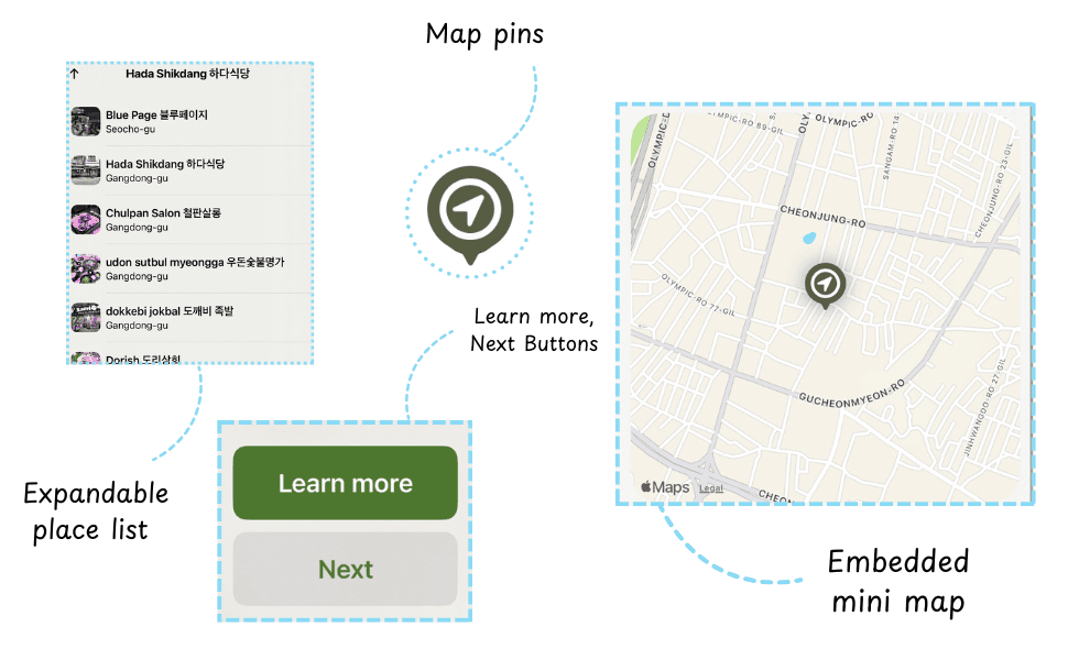
Expandable place list
Dragging the bottom card up reveals a scrollable list of nearby locations
Each row shows a thumbnail image, name in both languages, and district
Tapping a list item updates the map and the card, keeping the user oriented in the same view
Place Details View
A full-screen sheet with a large hero photo (or photo carousel) at the top
Place name, district, and category (e.g. Italian restaurant)
An embedded mini map focused on that single location
A Learn more link that sends users directly to the place’s website or social page
Sustainable Kibble Details View
Short, scannable information about each insect-based kibble brand
Clear notes on health benefits, the insect used, and basic environmental impact
A small Learn more about [brand] link that takes users straight to the brand’s website
Early on, I compared two entry patterns:
Version A: a full-screen map with an expandable bottom sheet for cards and the list
Version B: a list-first screen with a smaller map preview at the top
I went with Version A (map-first) because it better matches how Korean users already explore places on Naver/Kakao Maps and makes the question “Where can I go right now?” much easier to answer.
Ideation Focus: Sustainable Kibble Flow
For the insect-based kibble part of the app, I wanted 2 things to happen at the same time:
1. dog owners should feel like this is just another normal food option, and
2. they should get a simple explanation of why it's better for their dog and the environment
I started by breaking the flow into 3 steps:
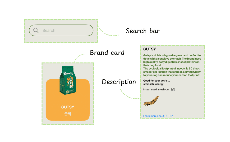
1. Entry point: "dog food" category
- a simple dog food page with a search bar, a kibble/treats toggle, and large cards for each brand
Each card shows:
- product image
- brand name in English
- brand name in Korean
This kept the first screen focused on choice, not education yet.
2. Brand detail page
Tapping a brand opens a detail page with:
- a large product image at the top
- a short description of what makes the kibble different
- a clear line about the health benefit
- a line about the insect used
3. Deeper learning as an option, not a requirement
- At the bottom of each detail page, I added a simple 'Learn more' link to let curious users go deeper without forcing everyone into long explanations